User Experience Design

UX Design & Interface Prototyping

When we say “UX design,” we don’t just mean layout and visuals. For us, it’s a way to understand how the business operates, what tasks users face, and how the interface can help them. We see UX as a fundamental part of the project — as essential as architecture or code.

24 24
Introduction

Introduction

Our team starts with the right questions: who will use the system, why are they using it, and what challenges might they face? The answers shape the logic of the interface — from the first steps to the key user actions. As a result, every screen is designed around clarity, interaction flow, and task efficiency.

UX design at Webdelo means:

  • understanding real user goals and tasks;
  • clear and predictable navigation;
  • screens free of clutter and unnecessary noise;
  • logical flow built before any buttons are drawn;
  • synchronization with project architecture and backend capabilities.
We design interfaces as working tools — shaped by tasks, scenarios, and technical constraints. That means fewer clicks, fewer errors, and faster goal completion. For the client, it means lower support costs, higher efficiency, and steady product growth.
Our UX Approach

Our UX Approach

Designing Interfaces from User Scenarios, Not from Buttons

An interface doesn’t start with buttons or screens — it starts with understanding user behavior. We always dive into real processes to see what actions users perform in the system, what roles they take, and how these actions form a meaningful journey. This is the foundation for building an effective interface.

We design user scenarios, not just page structures. Logical steps come first — what the user does, why they do it, and what data they need. Only then do we choose interface elements to bring that journey to life.
  • user scenarios describing behavior;
  • navigation flows (UX flow) mapping user paths;
  • user stories and screen-level tasks.
Users don’t perceive a system as a set of features — they experience a journey toward a goal. Our job is to make that journey simple, predictable, and fast. From entry to action — purchase, filtering, deal creation, or report generation — every decision is designed around the scenario, not the layout.

UX as Part of Project Architecture

Interface design is closely tied to the project’s architecture and technical solutions. From the start, we align user interaction logic with how the system is structured at the backend, database, and API levels. This approach is especially critical for complex interfaces where server communication, asynchrony, filtering, and data validation are integral to system behavior. UX must be considered before development begins — particularly for SPA (Single Page Application) projects or those built on microservice architecture. In such systems, the interface depends heavily on distributed server logic: data arrives in parts, interactions are asynchronous, and states must stay synchronized between modules. If UX logic isn’t defined early, the architecture becomes tangled, APIs overloaded, and user flows fragmented. We embed these considerations into the design phase to keep architecture flexible and implementation technically sound.

When UX is developed in isolation from architecture, numerous problems arise: missing scenarios, overloaded APIs, and unavailable data. That’s why we connect these two layers from the very beginning — achieving predictable results in production.
  • if the interface includes complex filtering — it affects database and API structure;
  • if there are multi-step forms — a mechanism for saving intermediate data is required;
  • if lazy rendering or infinite scroll is used — the backend must support pagination.
At Webdelo, designers participate in architecture planning and synchronize UX logic with development from the earliest stages. This prevents conflicts between “design wants” and “system capabilities.”

Complex Interfaces and Cognitive Load

In data-dense projects — such as trading platforms, admin panels, and analytics systems — it’s especially important to structure the interface so the user can focus on what matters most. We evaluate every element on the screen: whether it’s needed at this moment, whether it supports decision-making, and whether it distracts from the target action.

To reduce cognitive overload and simplify interaction with large volumes of information, we use several techniques:
  • structuring the interface so that blocks and elements are logically grouped, helping the user perceive them as a coherent whole;
  • using visual cues — highlights, icons, color markers — to emphasize what’s important;
  • moving secondary actions into contextual blocks or dropdown elements so they don’t interfere with primary workflows.

This approach helps users navigate the interface faster, avoid unnecessary effort, and perform their tasks confidently without mental strain.

Less visual noise means more focus. This makes the interface easier to process and increases overall efficiency.

Scenario-Based Design Approach

Each screen implements a specific user scenario — not just a set of controls. Pages are built around user goals, focusing on outcomes rather than visuals. We define what the user needs to achieve and design the shortest, most efficient path to that goal.

This approach reduces the number of steps, makes system behavior predictable, and keeps the interface intuitive. To keep the design focused on real tasks, we formulate concrete user action scenarios.

For example:
  • “The user logs in to quickly find and purchase a product.”
  • “The user filters deals by status and adds a comment.”
  • “The user generates a monthly report and exports it to PDF.”
These scenarios form the foundation of interface design. Each screen is built around a specific scenario. In this context, a “screen” is a logically complete step in the interaction — where the user performs one goal: filtering, selecting, submitting, viewing, or editing. One screen — one action. This increases clarity, speed, and control within the system.
Tools, Processes, and Design Handoff

Tools, Processes, and Design Handoff

Working in Figma: Structure, Rules, and System Thinking

Figma is our primary tool for interface design. We use it as an organized workspace with clear rules, structure, and repeatable approaches. This enables the team to work synchronously, consistently, and without surprises.

Within each project:

  • UI components and libraries are stored in separate files with clearly defined usage logic;
  • every element is reusable — buttons, inputs, icons, cards, and blocks;
  • layer, frame, and page names follow team-wide naming conventions;
  • file structure mirrors user scenarios, not just product pages.
This systematic approach makes it easy to scale designs, avoid duplication, and speed up onboarding for new team members. Developers can navigate designs faster, and designers can maintain layouts more efficiently.

Versioning and Design Handoff

To prevent chaos in files and maintain process stability, we treat design mockups the same way we treat code. Each layout is a documented logic unit — with change history, clear comments, and precise alignment with the development team’s needs. This is crucial not only for implementation quality but also for preserving a shared understanding across the team.

After approval:

  • the approved version is locked and cannot be changed without a separate task;
  • comments, annotations, variable names, and component behavior details are added;
  • handoff happens via Figma Specs and/or export of design variables in a format suitable for frontend (e.g., color, spacing, and font tokens).
This process eliminates discrepancies between “what’s designed” and “what’s implemented.” Everything is documented, versions are fixed, and changes are controlled.

UI Kit and Component Libraries

A unified visual language and consistent solutions are the foundation of scalable UX. To achieve this, we create and maintain our own UI kits that define both the visual and logical rules of the interface. They include basic elements (buttons, inputs, icons) as well as complex blocks reused across scenarios.

They are often based on:

  • Tailwind UI,
  • Vuetify (for Vue-based projects),
  • custom solutions built for Laravel Blade or React.
The core principle — every element in the UI kit equals a component in code. This simplifies the workflow for both designers and developers. Components can be easily scaled, replaced, and themed. A well-structured UI kit keeps the interface consistent, reduces bugs, and speeds up development.

Collaboration with Development

To ensure the interface doesn’t get lost between design and implementation, the designer stays involved throughout every stage of development. They participate in discussions, answer questions, review implementation, and take part in decision-making. This streamlines communication and preserves the logic embedded in the design from the very beginning.

This approach allows us to:

  • clarify element behavior immediately;
  • resolve Figma → code integration questions without delays;
  • verify implementation against specifications and design mockups.
We work with Vue, Tailwind, and Blade, accounting for platform constraints from the start. This ensures that elements are designed to match the system’s technical capabilities and limitations. Every implementation is reviewed for pixel-perfect accuracy — spacing, typography, and component behavior.
UX Principles and Best Practices

UX Principles and Best Practices

UX Principles: Hierarchy, Contrast, Readability

To make interfaces instantly understandable and intuitive for users, we apply a set of proven principles and design patterns. These approaches help build a clear visual structure, simplify navigation, and speed up decision-making. They are grounded in cognitive research and our practical experience with complex B2B systems. In our work, we apply:
  • Visual hierarchy: key elements come first, supporting ones follow;
  • Contrast and scale: buttons, links, and headings remain visible in any context;
  • Fitts’s Law: actions are placed closer and clickable areas are made larger for efficiency;
  • Miller’s Law: screens are kept clear by grouping information into digestible blocks.
Every element — from headings to input fields — must be clear and logically integrated into the interface. We verify readability, hierarchy, and perception flow at the design stage. This ensures the interface feels intuitive and user-friendly long before development begins.

Consistency and Interface Standards

Consistency is one of the key factors influencing user confidence in a system. An interface becomes more intuitive when similar actions and elements behave the same way. This is especially critical in complex systems where users switch between multiple screens and workflows.

To ensure this, we:

  • use shared interaction patterns;
  • maintain a unified visual style through a UI kit;
  • formalize component and animation behavior in a design guide.
This simplifies both user experience and system implementation. The interface becomes predictable, scalable, and easier to maintain — without extra effort to preserve visual and functional consistency.

Working with Forms and UX of Errors

Forms often become a bottleneck in the user journey. They appear in nearly every scenario — from registration to reporting. A poorly designed form can stop a user in their tracks, even if the rest of the system is well-built.

To make forms helpful rather than frustrating, in every project we:

  • simplify form structure — only necessary fields, no overload;
  • use inline hints and sample inputs placed next to fields;
  • validate inputs instantly, without page reloads;
  • display errors clearly — with text, color, icons, and automatic focus on the field.
A form is the point where users share data with the system. If friction occurs here, it directly affects key metrics — drop-offs, incomplete actions, and support requests. That’s why a well-designed form isn’t just about convenience; it’s a core driver of business performance.
IMG_7020 2 cropped_image
«If a form is confusing or overloaded, the user loses trust. We design forms that can be completed without instructions — directly reducing abandonment rates.»

Anna Isakova

Webdelo UX Designer

Accessibility

Accessibility is a key trait of a mature interface. It defines how comfortably users with different interaction methods — mouse, keyboard, or screen readers — can work with the system. It’s not just a formality but the foundation of a truly universal product. We integrate accessibility into the project from the earliest stages to ensure usability for everyone, regardless of their device or perception abilities.

Within every project, we ensure:

  • sufficient text and background contrast;
  • readable, non-decorative fonts;
  • keyboard navigation support (tab focus);
  • descriptive attributes for screen readers (aria-labels, alt tags).
These aspects are easy to address at the design stage but difficult to fix later — that’s why we build them in from the start.
A page load increase from 1 to 10 seconds makes users five times more likely to leave.
Google Analytics data shows that when page load time increases from 1 to 10 seconds, the probability of user abandonment rises more than fivefold. This highlights the critical importance of adaptive and fast UX.
PDF — Think with Google
Projects and Examples

Projects and Examples

How We Designed the Interface of a Trading Platform

When we design trading interfaces, aesthetics take a back seat to reliability, readability, and risk reduction. Streaming data, rapid decision-making, and dense layouts all demand absolute clarity. In one project, we faced the challenge of enabling users to simultaneously monitor chart changes, make decisions, execute trades, and track notifications — all within a single interface.

Main objectives:

  • display as much information as possible without overloading the user;
  • provide instant feedback to user actions;
  • prevent accidental errors during order execution.
We applied a scenario-based approach, breaking the interface into modules focused on one action at a time. For example, the trading block appeared only on hover, charts featured customizable layers, and notifications followed separate logic that didn’t interrupt the main flow.

The result was an interface that maintains focus, avoids cognitive overload, and enables safe, efficient work in a high-density data environment. This approach reduces error risk, saves time, and increases trader productivity.

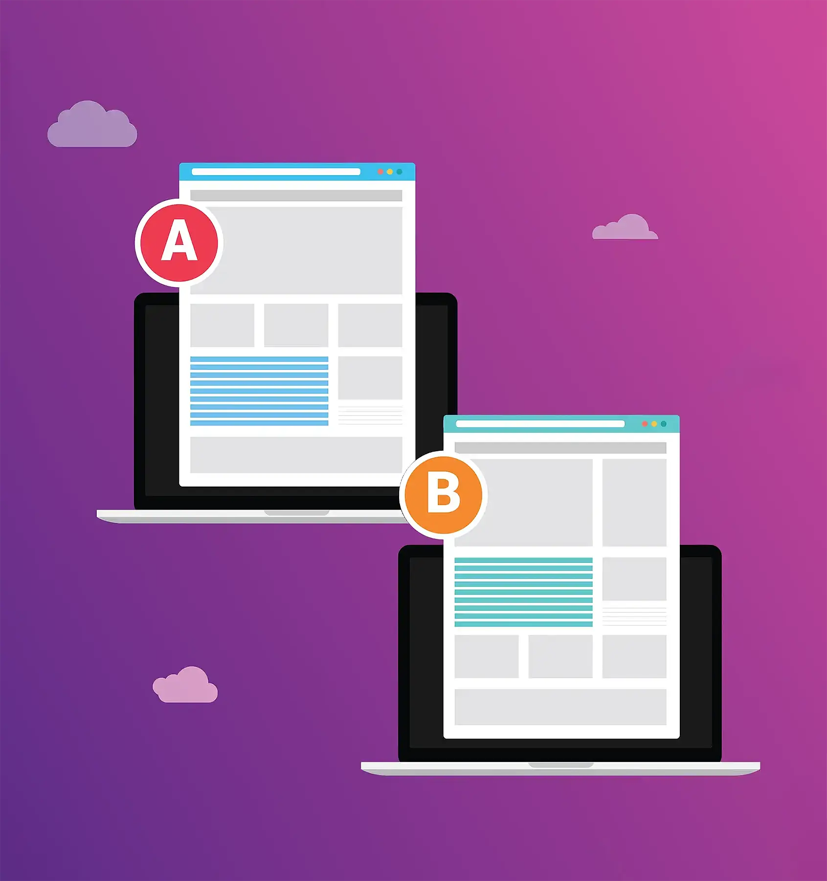
Before/After UX Redesign Examples

UX redesign isn’t about “refreshing the look” — it’s about improving the user journey. We approach it as both a research and engineering task: first identifying where users get lost, which actions take too many clicks or too much focus. One example was a CRM system where the abundance of interface elements made navigation slow and confusing. The original interface included:
  • over 12 items in the sidebar menu,
  • forms overloaded with 20+ fields,
  • actions without visual cues or logical grouping.
After the redesign:
  • the number of clicks for a key scenario dropped from 9 to 4;
  • the average task completion time decreased by 35%;
  • support requests related to interface confusion fell by 48% in a quarter.
We completely rebuilt the navigation structure, reduced form fields, added inline hints, and highlighted primary actions. The redesign delivered a measurable impact: users completed key tasks faster, and system support required fewer resources. We didn’t just simplify the interface — we turned it into an effective tool for the client’s team.

Conclusion

We approach UX design as a systematic process that begins long before the first mockups and continues well after the product launch. The process involves not only designers but also architects, developers, and analysts. It’s a collaborative engineering effort centered around user scenarios and business goals. Our approach is built on the following principles:
  • we start from the user’s goals and their journey within the system;
  • we design the interface as part of the architecture, not an add-on;
  • we use a repeatable process in Figma and structured UI kits;
  • we synchronize design and development at every stage;
  • we apply UX best practices — readability, logic, accessibility, and scalability.
This approach allows us to create interfaces that not only look good but also effectively solve user problems. They are clear, intuitive, efficient, and resilient under growing load and evolving business requirements.

Want to Discuss Your Project?

Submit Your Request — Let’s Take Your Business to the Next Level Together.

Start a project